Election campaign branding and material
Election campaign branding and material
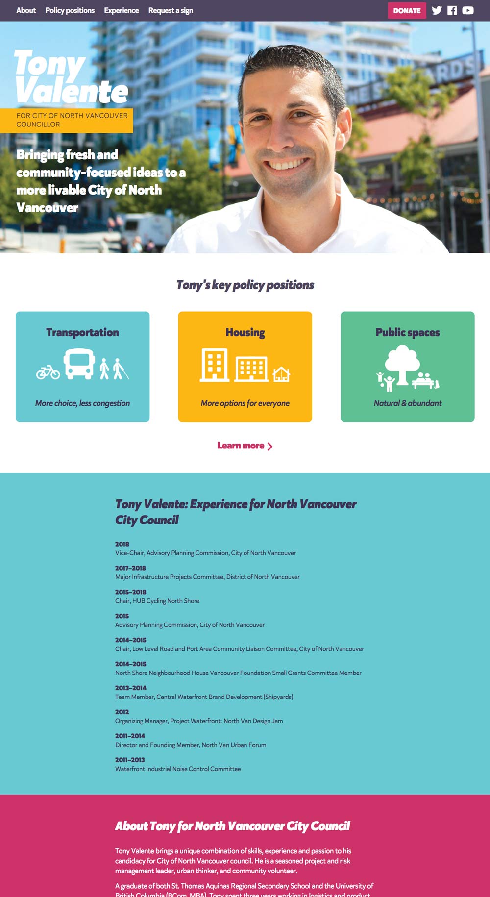
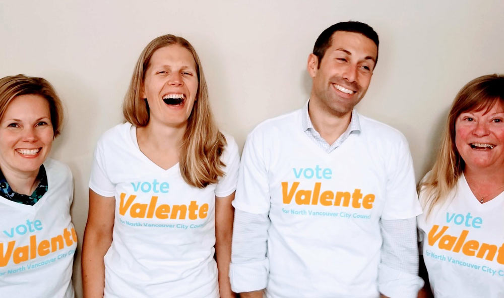
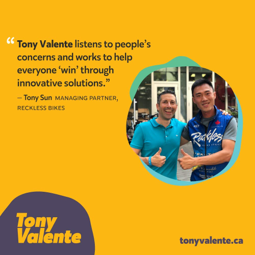
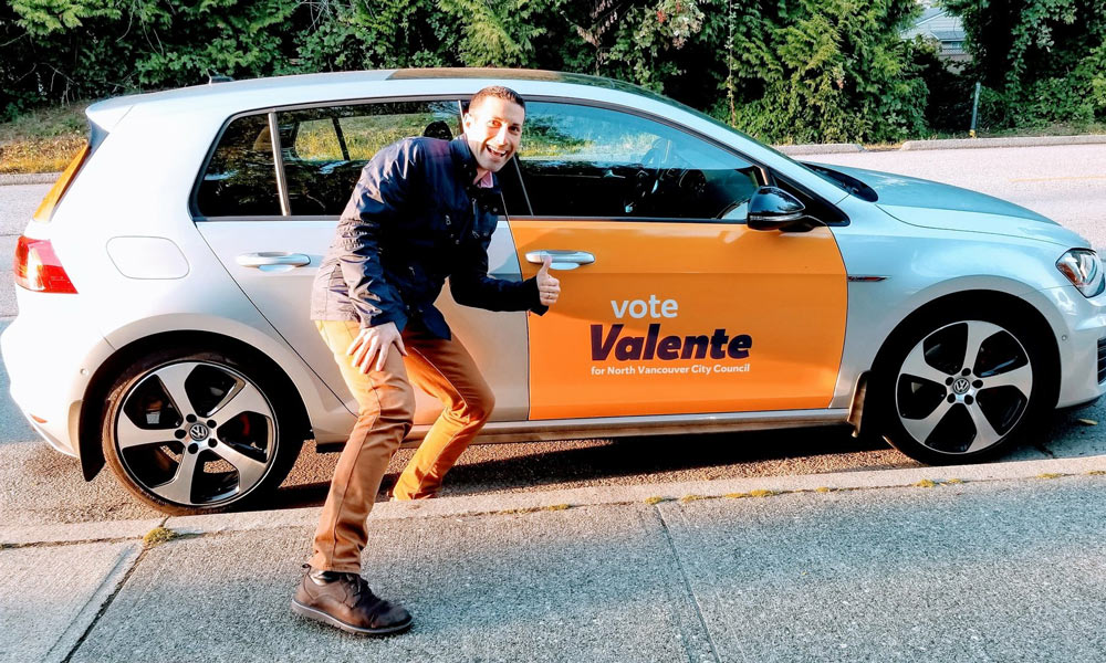
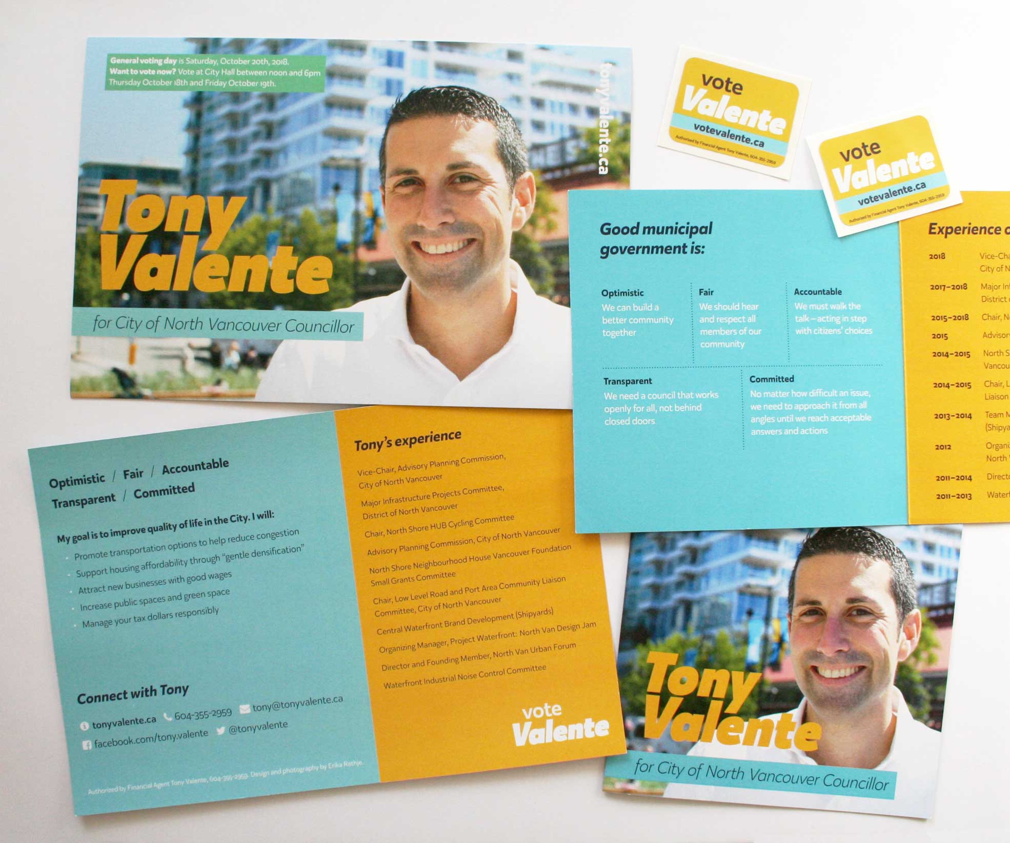
I designed a winning campaign brand that helped elect Tony Valente to North Vancouver City Council in third place in 2018 and re-elect him in first place in 2022. Tony earned about 56% of the vote in 2022, on par with the incumbent mayor. Tony placed 11th in his first bid for one of council’s six seats in 2014.
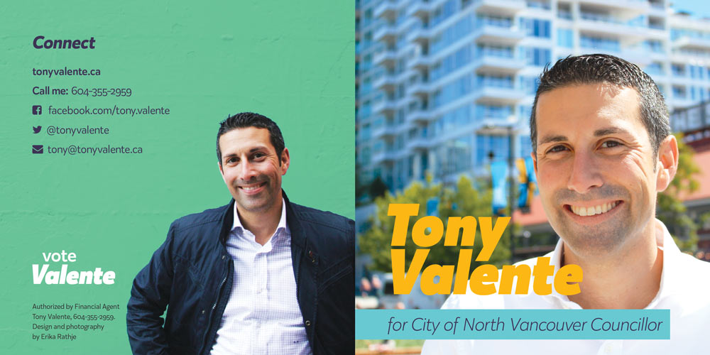
A brand refresh was needed for his second bid for council 2018. The team wanted something fresh, genuine, friendly and professional which would, in part, engage younger voters. Colours were inspired by an activated alley in the city (Fun Alley) and represented Tony’s personality. Photography reinforced a positive, approachable and personable candidate image.
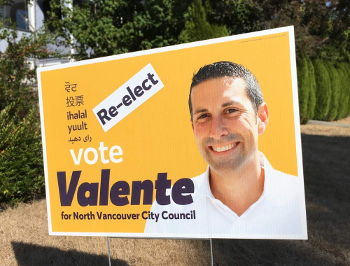
For street and apartment signage I used yellow as it is the first colour the eye sees, which proved very effective in both 2018 and 2022 campaigns, and which the team called “genius.” In a torrent of mainly blue and green signage, his bright, uncluttered sign stood out extremely well. This also served to reduce the number of signs needed, contributing to a more sustainable and economical campaign. It was also the only sign to have text in multiple languages, including the Squamish Nation language. In 2022, we simply added a “re-elect” sticker to enable us to reuse signs, a strategy also used by other candidates.
In engaging with the community, Tony’s brand, promotional pieces and photography received a ton of praise, including having the website described as “by far the best of all the candidates’.” Another local said the collateral design was some of the best she had seen on the North Shore in this election.
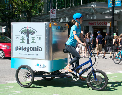
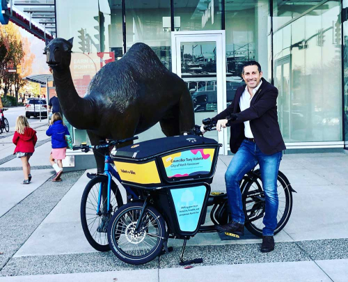
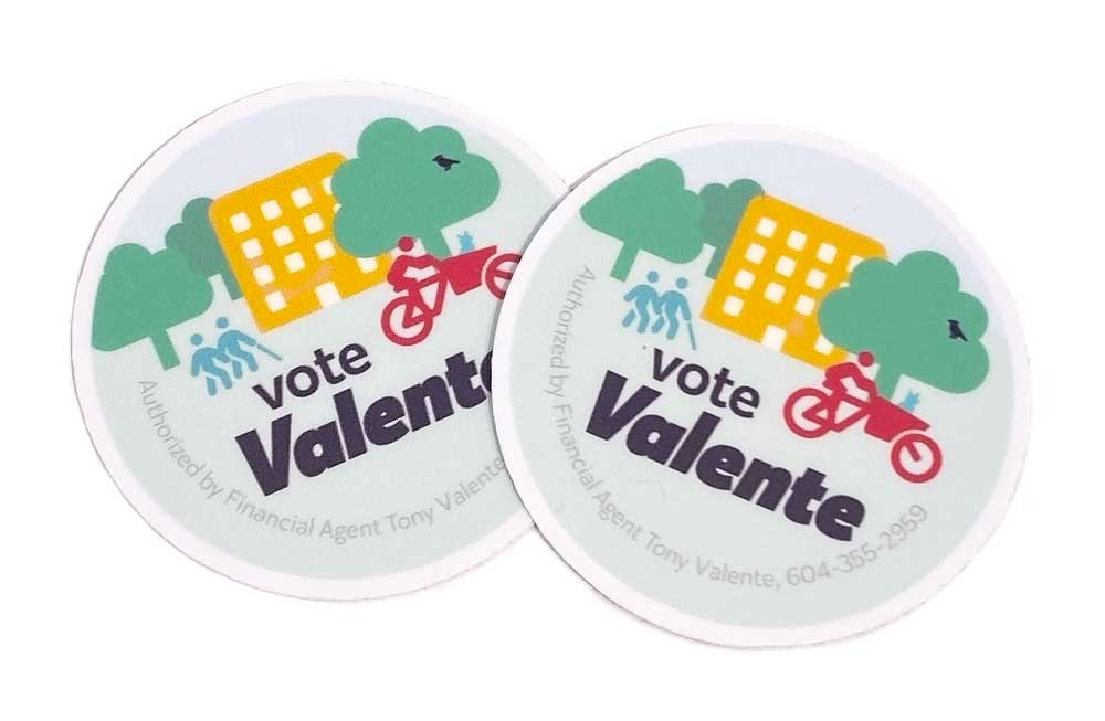
In 2021, I designed a colourful wrap for Tony’s cargo bike, which makes it hard to miss out in public. In 2022 I designed a new sticker around Tony’s principles, and reused the dog icon designed for the homepage. (Other icons from or adapted from Font Awesome icons.)
During the official campaign period in 2018, the website received about 4,000 pageviews.
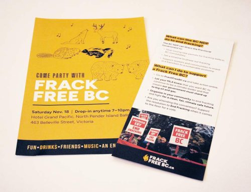
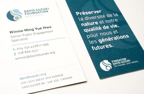
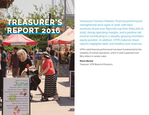
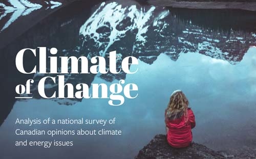
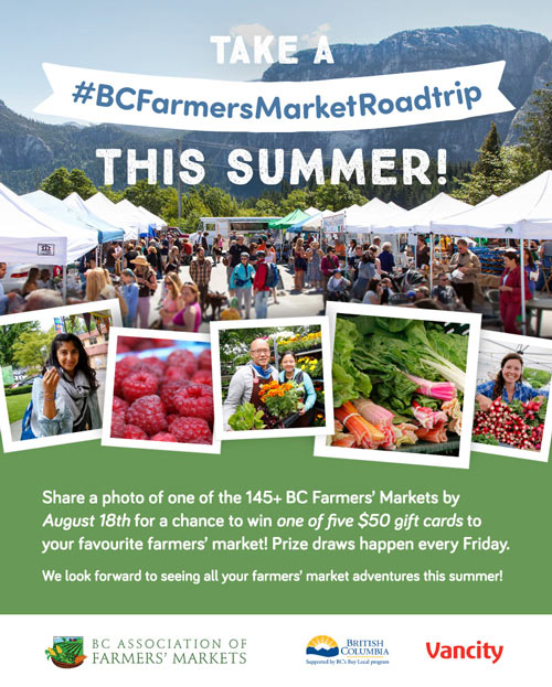
Deliverables: brand, website, brochures, signage, bike wrap, car wrap, stickers, photography, t-shirt, social media graphics. Responsive website (with some Farsi content) developed with WordPress.
Services: brand strategy, design, web development, photography, some copywriting (slogan and tagline).
I wanted to thank you for your amazing ability to express Tony’s values in a visual way. So many have commented on the signs now! The yellow is magic. Your design insight and intuition will help so many in the future.
– Heather Drugge, campaign manager
View website »I am proud to recommend Erika Rathje. She is passionate about her clients and ensuring their message comes alive in colour, form, and overall presentation. Our engagement started with her looking at what other similar campaigns had done locally, nationally, and internationally. She took the time to help me and my team understand the significance of colour and how it is perceived in messaging. She dove into the details to ensure print quality met expectations.
At times I would have settled for a simple solution, but Erika was having none of it. She pushed the team and I to explain our messages and supported the messages with her graphics. I valued her diligence and drive, and the results speak for themselves.
People on the street recognized me from signs done by Erika. A veteran campaigner leading a contested campaign in another jurisdiction commented that our print materials were “among the best in Metro Vancouver”. More importantly: we won. This is because our message described through Erika’s work resonated with the public.
– Councillor Tony Valente

