Columbia Institute website
Columbia Institute website
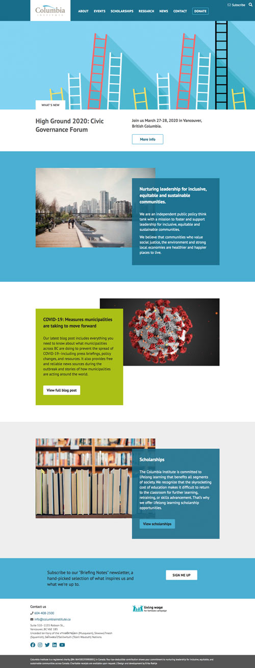
Columbia Institute sought to merge their two websites into one and deliver a modern, more functional experience. The new site is easier to navigate, responsive and better explains what they do. The homepage now has a single point of focus for major updates — such as their annual conference for civic leaders — and flexible spaces that offer the content people are after.
I conducted a review of their analytics, a heatmap survey and a visitor survey to determine what their most in-demand content was and what wasn’t working. This informed the content of the homepage and the site navigation. We were thoughtful about how to label sections of the website and trim the navigation to just what was necessary.
The complex High Ground conference page is designed to enable registrations and give attendees (or potential attendees) a clear and easy to read interface before and during the conference. The back-end for this is highly customized and easy to edit for the client, without the risk of breaking anything.
Accessibility efforts include ensuring adequate colour contrast, avoiding redundant links, semantic use of code and content, large touchpoints and encouraging the client to use best practices with link writing.
Built with WordPress, CSS Grids, SASS and Advanced Custom Fields.
More images coming soon.
View website »

