I know I’ve been quiet for awhile. I haven’t been answering some emails, I haven’t been washing the dishes, and I’ve either been sleeping too much, too little, or too poorly. To top it off I now have my second cold within a month! I guess that’s what I get for being in good health, rhinovirus-wise, for a record 9 months. I think this is the first time that my boyfriend and I have exchanged a cold. Shucks, I thought our proximity would make us immune!
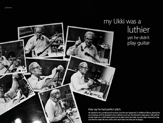
I’m busily working through my grad project, titled Coffee and Pulla, and having finally found my passions in it, I’m at full steam ahead. (Minus the setbacks from the head cold, of course.) So, above is one spread from the book. This one is about my grandfather, and features some stunning old photographs I’d never seen before! I diligently spent probably 2 or 3 hours in Photoshop trying to digitally sew two photographs together. That is, two photographs I took of these photographs. They were at slightly different angles, so it took a lot of cunning, despair, hope, and determination to get it looking optically perfect, though truthfully, a little skewed. 🙂 Without the originals, no one will be able to tell. I’m pretty happy with it!
My middle name is procrastination unless I’m truly excited about something, so while I quite willingly and eagerly (frighteningly eager) stay up until 4am working on a comp for the grad website (they liked it!), you probably won’t find me working on a print project at 4 in the morning. It’s just not my stuff… but I’m finding out I’m not so bad at it, after all.
I’m designing a book about Finland (called Coffee and Pulla), explored through family stories and comparisons to Canada. As a requirement, I need a mentor. Very little contact is expected by my instructor — 2 or 3 times over the semester, which ends in mid-April — so it may only require an hour or two of your time over the course of a couple months. Any time spared is appreciated.
So who can help me?
I’m looking for any combination of:
a) a Finn who immigrated to Canada (or at least lived here for some length of time) OR
b) a Canadian who immigrated to Finland (or at least lived there for some length of time)
c) a (graphic) designer, particularly if one of the above
d) a writer
e) a photographer
This is short notice because my to-do list lives at the back of my head, but I digress. I’m under the impression I need the information by February 5th (a week from today). HOWEVER, reponses after that, though they may not be “official” on the sheet, are still appreciated! The more mentors the merrier.
So what would I like from you?
a) responses to my questions about Finland, similarities to Canada
b) responses to any other questions
c) relevant personal experience, perhaps
d) design, art, writing feedback (criticism/praise)
e) anything else you feel is applicable to offer
My target audience is ages 25 to 30, Finns and Canadians, but this doesn’t apply to my mentors 🙂
Please reply either in comments here or to design [att] erikarathje [dott] ca.
Thank you / Kiitos!
Here we go again! My school started up again earlier than usual, and earlier than everyone else, which miffed some people, but we had a good turnout for our sociology class about blogging. I suspect they may have lengthened the semester by one week by starting early, but if I’m not paying more, well… still. An extra 6 days is a lot. Now I don’t know when I’ll take down the tree!

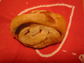
Pulla, a kind of Finnish baking. I ate it.
The big thing, of course, is grad project numero duo for those of us not doing a year-long project, like moi. I wanted to, but I knew I needed to do something totally different. I spent two semesters on social causes, and it’s tiring. I also spent two semesters on food-related websites, so I’m doing a print-based project. Honestly, food is a small factor, but it’ll be my delicious discussion about Finnish food. That brings me to the idea. While I want to focus more on design and improving my design skills, the topic I’m working through is about Finland. So far, it shall be a book about Finland’s culture, geography, and language (and social structures?), with comparisons to B.C. and Canada. I expect to also include a small travel diary with photos from my family’s trip in 2000. That castle really wasn’t as big as it looked on TV. In retrospect, I wish I’d actually kept a proper diary, but I did bring home much memorabilia.
Continue reading Coffee & Pulla »

Last Wednesday, the 13th, I presented my grad project, AfterTASTE: What’s wrong with our food supply? It’s a website about the decline of nutritional value in conventionally-grown/raised food. I’ll still be adding to it when I have time. Meanwhile, I encourage you to browse the site, and please leave me some comments in the blog!
Tomato season is over in the city and, it seems, for my project title.
“Tomatoes don’t grow on trees: The decline of the quality of food in North America” (phew, *rests tongue a moment*) is not going to be the title anymore.
Instead, it will be ………… ? Sorry, I don’t know yet. I’ve mulled over a few and so far nothing is doing the job of a) communicating what it’s about, b) offering a web-searchable title, c) being emotional enough instead of scholastic.
My friend pointed out the name of this one as being a good example. That’s good.
Thirteen cent tomato.
HA…
I think part of the reason is my influence from books. The End of Food. The Omnivore’s Dilemma. The Hundred-Year Lie. Food Politics. The Crazy Makers. Food Fight. Actually, the last two are closer to what I’m supposed to be getting at. Someone suggested Food Fight in class, and I said no, that’s already a book! (By Brownell & Horgen.) And, ah crud, they’re all due back on Tuesday! (except 100-year lie and Omnivore’s because I bought them.)
I’m not going to change the address of the site/blog because moving everything over and changing image URLs etc. is just not worth the time right now. The good news is, the navigation is now cross-browser compatible, after the resolution of a very simple glitch. Yay! (Thanks, Alex!)
I don’t know where it will head from its current state, but if you happen across it and it looks like utter chaos, you can bet I’m in the middle of something. However, if you’d like to leave a comment or offer some guest authoring, I would be greatly grateful. You know where to go!
So my new blog (project blog) is looking extremely… BORING! And I have only a few days to fix it, but I think I know how. In the meantime, I took some time to create one of my concept images, which relies on an idiom. Idioms can be a problem since they’re highly culture-centric, but as a classmate pointed out, if you don’t know what it means, you can always ask! Or look online. I imagine the context of my site would offer clarification anyway. Fortunately, this particular one is fairly self-explanatory, but its meaning (having artificially optimistic appearances) should be known in order to lend a full comprehension of what I’m getting at with this:

Unfortunately, and I realised this only when I exported to a JPG for the web, the colour will be different everywhere and to everyone. Fortunately, the web version turned out a little more realistic than the one in Photoshop. (It’s just what Photoshop does.) To my eyes, it looks natural, and hopefully it won’t be too different everywhere else, but hey… any food image will be dealt the same fate. What can ya do…
So, what do you think?
I’m having a heck of a time trying to create something good, fresh, and exciting for my project. I may be getting bogged down by starting from an existing blog template. I thought about starting from scratch, until it started working well, and now it isn’t. I did it the same way with this one, but I established most of the colour scheme based on my site, where the colour came by accident.
I have these fantastic palettes of colour in Illustrator, and while together they look amazing, separately they’re… bland and boring. And yet, if I go for bright, it’s too much. I think that’s where the variable tonality of images comes in.
I have pictures in my head of what it could look like constantly going by, yet I think of the possibilities offered by boxes, and I’m just not feeling it. I mean, it looks fine. People can use it. Whatever… but it doesn’t feel like food. It feels like a twig of wheat. It’s too cooshy. Not edgy enough.
More time is spent thinking, reading, observing, and writing than form-building. Dobson says, just make tons of form. Make tons of crap and you’ll end up with something. I definitely made tons of really horrible comps on the last project, which is what a designer is supposed to do. Tons of bad ideas. Part of the pressure here, though, is trying to reach a certain threshold for what a grad project is supposed to be. Yet more ideas, but are they feasable? Is it me? Is it appropriate?
<<<Insert big frustration word here in all caps followed by several exclamation marks>>>
Oh, I know.
ARGH!!!!!!!!!!!!!
There.
*Sigh*
Now that wasn’t so bad, was it?
This project has been nothing but creative blocks and mental self-mutilation. “What was I thinking?!” “I wasn’t thinking!” “I misinterpreted what you meant by presenting with boards.” “Paper’s too shiny.” “God, that’s ugly.” “This isn’t good enough. You’re not good enough. I give up.” “You’re not spending enough time on this.” “Boring.” “I’m not feeling it.” “Sigh.”
I’m thinking maybe starting with the blog isn’t such a good idea. I’m also thinking about abandoning it being all done in MovableType, but we’ll see. I do just as well with XHTML. Maybe I’ll create a blank white box with a grey border in CSS and see what happens. Fill it in mentally with a pencil crayon. Go to my sketchbook with a set of colours that work well together and just muck around. It worked the last time.
Argh.
I delivered the first set of my neighbourhood questionnaire yesterday evening, while waiting for the rest of them to print off. (Might have taken longer than photocopying, but it was easier to read and not messy.) I don’t know how many responses I’ll get, but if you happen to be here because you received my survey on your doorstep, welcome!
This post will give you a bit more insight into my grad project and the issues surrounding the decline of food quality in North America, also called The End of Food, so named by Canadian author Thomas Pawlick. I stress that it is not a doomsday book so much as an encouragement to make changes in your lifestyle to counteract the changes in industry.
Continue reading Hello, Neighbour! + Grad project overview »
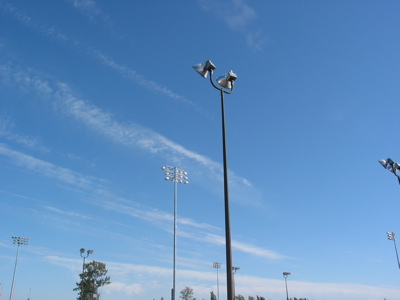
Walking home on Friday, I spotted some incredible clouds stretching across the sky. It’s pretty flat where I live — god, I miss the mountains! — which makes the sky all the more fascinating. By the time I got home, took some shots in the back yard, and decided it was still worth it to capture the sky from where I’d been walking, the clouds had drifted over quite a bit. They were overhead before, which made it all the more majestic. Anyway, here’s what I got…


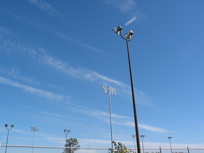
On the way back, I saw some more interesting, wispy clouds and stopped to take a photo. I figured I should probably stand in the shade, so in the shadow of “my” house, I looked up to the left of my target and saw something amazing! I guess if I’d tried I might have seen a halo, but oh well.


Stepping back for a sunlit shot, blindly!
