Websites can be complex beasts. So the common question, “how much does a website cost?” is pretty similar to “how much does a house cost?” The simple answer is, it depends. There are so many factors that determine a website’s cost or time to build — as with a house — that there is no single answer. But with enough information, an estimate can be made for yours.
Websites, like anything else one designs, don’t appear magically — they’re the end result of a thoughtful and collaborative process that takes time. To take some of the sticker shock out of the price tag of websites, here’s what a typical successful website design process looks like, along with some tips:
Discovery
How do you describe the character of your organization? What are your website goals? Who are your current and desired audiences? I could go on, but the quality of this first phase determines the outcome. The more accurate the answers are, the fewer revisions and mistakes will occur down the road. This is a good time to tell your designer* if your audience is, for example, over 75 or if they’re mostly in a rural area. Different audiences’ needs are different. Be as specific as you can.
“Poor user experiences inevitably come from poorly informed design teams.”
— Jared M. Spool, founder of User Interface Engineering
Research
I’m giving this its own phase, though research is also included in other phases such as discovery and usability testing. I’m by no means an expert on all the types of research, so I’ll point you to Erika Hall’s Just Enough Research for a great overview (and more). Responding to a common objection of “we don’t have time” to do research, she says: “You don’t have time to be wrong about your assumptions.”
Continue reading 11 phases to a successful website design »
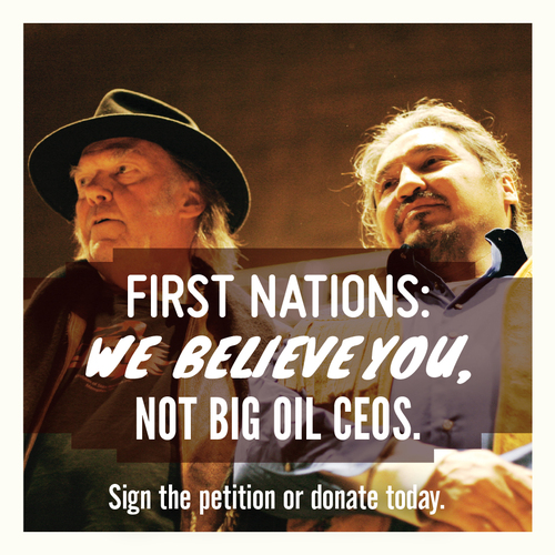
It can be difficult to grasp the scale of Edward Burtynsky’s subjects when there are no points of reference — no recognizable objects, intentionally no humans, and sometimes no horizon. Your understanding of what you’re looking at changes between close proximity and several steps back. Sometimes it’s better just to wonder, because comprehending the vast scale of a field of oil drilling rigs, Alberta’s oil sands or a coal mine in BC can take the wind out of you — at least, if you’re as affected as I am by these visuals. I left feeling pretty drained as it’s emotionally taxing to look at how we’ve shaped, polluted and destroyed the landscape of our planet to meet ever-growing needs. Not everything in the Vancouver Art Gallery’s exhibit of Burtynsky’s work was dark, but a bleak image of a massive pile of tires (at a distance, just a huge wave of black) burning after a lightning strike had me reeling and thinking, “what have we done?”
“In Burtynsky’s vernacular, the ‘manufactured landscape’ is no longer a simple contest of nature versus culture; instead his images suggest an emergent condition in which the natural world has been fully consumed, never to reappear again.” — Vancouver Art Gallery
I was standing in front of a large format aerial photograph of a Scottsdale, Arizona suburb when the woman next to me said, “this is the scariest one.” I don’t know if she’d been to the other side of the exhibit yet, but I understood what she meant. A rectangle of desert with a road around its perimeter marks the Navajo reserve, abruptly divided from suburbia, which is the usual unsustainable pattern: tendrils of cul-de-sacs, single-family houses — many with pools — tennis courts, and trees, all supported by a dwindling water supply. Far, far in the distance one can see a few towers in Phoenix, an unpleasant highway commute away. Now that I have time to absorb it, the connection between this and the rest of the exhibit is clear: the activity documented by Burtynsky feeds this horrific exercise in “community planning.” Artificially cheap oil, mining coal and metals, irrigating the desert — it’s all to feed an insatiable appetite called the American Dream.
I’ve been working for months on various campaigns working to shift away from Canada’s large-scale, rapid energy extraction, consumption and export economy, and toward green energy and jobs. Our opposition is wealthy and determined, and the media not always kind. Exhibitions such as Burtynsky’s, or similarly Chris Jordan (on consumption and waste), help to bring a real-life tangibility to what corporations and consumers are doing. It’s up to us to fight for the alternatives, and to be reminded of the ways in which we can meet reasonable needs responsibly.
To that end, here are a few ways you can get involved:
Sign the pledge to push for a fair, province-wide vote on oil pipelines and tanker traffic in BC
100 in 1 Day, Vancouver edition — multiple workshop dates culminating in 100 urban interventions on June 7th each in Vancouver, Toronto, Montreal and Halifax
CanRoots, May 23–24
10th anniversary screening of The Corporation, May 26th
The Edward Burtynsky exhibition at the Vancouver Art Gallery ends May 26th.

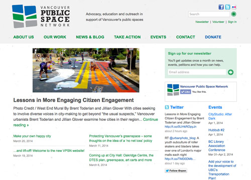
It’s with great pleasure that I share with you a project that was long in the making. Built entirely by volunteers, the new Vancouver Public Space Network website is a labour of love that began about three years ago. I think that extended anticipation made the ultimate launch that much more exciting for me and, I think, for them. It’s also amazing to consider how much technology has changed since our first conversation.
The Vancouver Public Space Network advocates for better public spaces and is responsible for such fun events as Parking Day and the annual Halloween SkyTrain Party and SeaBus pirates. (Not to be confused with the No Pants one. Although, I guess you could go without pants as Donald Duck if you wanted.)
As an advocacy organization, the VPSN works to champion the importance of public space to the overall liveability of the city. … Our work attempts to provide a blend of focused research and design work, creative community engagement and a celebratory, solutions-based approach.
I’m proud and honoured to contribute to the success of this important organization that works to improve our urban life. I’m grateful for Nicolas Demers‘ countless hours bringing it to life, and to a team that changed hands partway through and which pulled it all together so beautifully. Alissa, Jillian, Graham, Jessica, Andrew and the rest of you behind the scenes: thank you for taking this journey with me and congratulations! I can’t wait to see where you go.
Be sure to check out their upcoming events and please consider supporting the VPSN with a donation.
Got a project that needs design love? If you’re with a business or non-profit making positive impacts, I’d love to hear from you.

I’ve always cared a lot about our planet. I was the kid asking other kids not to dig all the clay out of the creek bed at our elementary school. I’ll never forget coming home from a trip at age nine to find a forest off the main road gone. Or at age ten seeing clearcut mountains on the way to Tofino. It hit home for me. I understood the issues. After all, this was the age of Captain Planet. But I think kids generally “get it.” I never understood why people litter (because garbage magically disappears, right?). I stomped on tin cans a lot to recycle them and was brought up to not waste food. I have an obsession with trees that’s visible in my drawings going back, well, forever.
Continue reading Designing for good: why I do what I do »

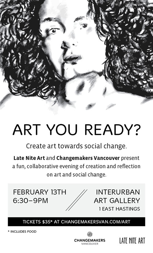
I volunteer my time and design skills to an awesome burgeoning group called Changemakers Vancouver, which is “a network of people who want to learn, share, and act so to make the world a better place.” On February 13th, we’re teaming up with Late Nite Art for an evening around what insights we can gain when we engage our creativity.
Late Nite Art is a facilitated workshop that brings community together to collaboratively explore thought-provoking ideas and issues through visual arts. We achieve this by combining fresh local food, gratuitous beats, and explorative artmaking in one tasty package.
You definitely don’t have to be artistic to participate. In fact, I think the more diverse a crowd we have, the more interesting and fun our evening and outcomes will be!
Really good food is included in your $35 ticket, which you should get today since capacity is limited.
See you there!

I’ve been driven for at least six years by a desire to make a positive impact on my community and the world. It’s a major reason I worked for the David Suzuki Foundation (and loved it), and a factor in my decision to start my own business. It wasn’t a career choice I’d ever seriously considered for a number of reasons. But I reached a point where my need to affect change, help organisations I’m excited about, and use all my professional skills outweighed some obvious downsides of going solo. (Yes, I do miss having a team.)
Gratefully, it turns out I quite like it.
Here are a few highlights from my first year (well, almost), which includes volunteer work. (Because why not?)
Continue reading Making an impact: my first year in business »

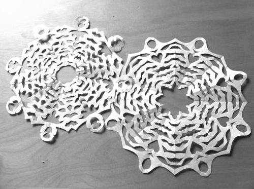
My godsister showed us how to make a perfect snowflake over twenty years ago. Below are easy steps to fold and cut a beautiful snowflake, and tips on making it intricate.
Supplies you’ll need:
- Light-weight white unlined, acid-free paper* (I’ve been using old paper from school)
- Good, sharp scissors that are comfortable to hold
- Weights such as a couple heavy books
- White putty to hang snowflakes
- Your imagination!
* Paper that’s not acid-free will yellow over time. You don’t want that!
Make sure your folding is as accurate as possible on edges, and press down your folded edges.
Continue reading How to make a perfect paper snowflake »

PRACTIVISM 6
Friday, November 29th, 2013
6pm – 10pm at The Ironworks
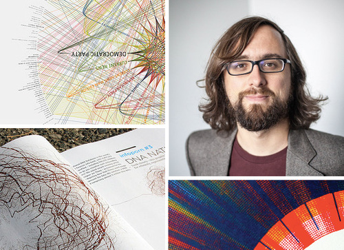
If you’ve attended any of the previous Practivism speaker events, you probably don’t need convincing to attend this one. Now in its sixth year, the annual event brings change-making creatives from Vancouver and beyond to talk about their projects and the designer’s role in influencing change, whether it be social, environmental or in our practice. This year the keynote speaker is artist and educator Jer Thorp. “Coming from a background in genetics, his digital art practice explores the many-folded boundaries between science, data, art, and culture.”
Our 6th annual Practivism event will explore the opportunities that lay in front of each of us within the vast amount of data we pass by on a daily basis. A panel discussion with Alex Beim, Casey Hrynkow, and Eric Karjaluoto, moderated by Amanda Gibbs will further explore the possibilities and challenge individuals to take action — to envision and mobilize a better future.
The event has grown a lot since its sustainability-focussed beginnings. I’m looking forward to seeing what Thorp offers the event and audience on November 29th.
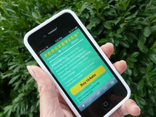
Get your tickets online now. Practivism sold out last year!
See you there.

The increasing prevalence of smartphones and tablets has dramatically changed how people access the internet, to the extent that a statistic from last month is out of date today. As a consequence, people — rightly — have the expectation that your website will be easy to read and navigate on their iPhone or Nexus tablet. At best, a website not optimized for an experience on a smaller, touch-based screen will frustrate the visitor but they’ll complete their task (contacting your organization, finding your opening hours, or buying an item for example). At worst, they’ll give up and take their fingers — and business — elsewhere.
Some convincing math on mobile
There are many ways in which having a mobile-friendly website helps your business or organization meet or exceed its goals, not the least of which is making it easier and faster for people to buy your products or complete a petition. But if you’re not convinced there’s a critical mass waiting to look you up on their phone, here’s one juicy fact: an Internet Trends 2013 report shows that 15% of all traffic on the Internet worldwide is now on mobile, and projected to grow 150% per year. That number, of course, may vary for your site; sites I’ve worked on this year are achieving upwards of 20% mobile traffic. If a lot of your traffic comes via email or social media, changes are those numbers are higher.
Continue reading How can responsive retrofitting benefit your business or organization? »
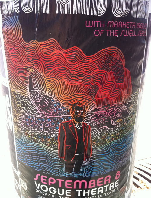
I have a thing for street posters. I’m often photographing these in the thin moments between changing walk signals. Band posters played a role in getting me interested in design when I was a teenager, though I don’t think I’ve ever had the opportunity to make one. Rarely do I even make it to the event. These are my favourites of the past couple of years.
Commentary follows each image.

This one for Iron and Wine reminds me of the crayon-layered images I made as a kid. And it might be made that way.
Continue reading Street posters, a mild obsession »
