11 phases to a successful website design

Websites can be complex beasts. So the common question, “how much does a website cost?” is pretty similar to “how much does a house cost?” The simple answer is, it depends. There are so many factors that determine a website’s cost or time to build — as with a house — that there is no single answer. But with enough information, an estimate can be made for yours.
Websites, like anything else one designs, don’t appear magically — they’re the end result of a thoughtful and collaborative process that takes time. To take some of the sticker shock out of the price tag of websites, here’s what a typical successful website design process looks like, along with some tips:
Discovery
How do you describe the character of your organization? What are your website goals? Who are your current and desired audiences? I could go on, but the quality of this first phase determines the outcome. The more accurate the answers are, the fewer revisions and mistakes will occur down the road. This is a good time to tell your designer* if your audience is, for example, over 75 or if they’re mostly in a rural area. Different audiences’ needs are different. Be as specific as you can.
“Poor user experiences inevitably come from poorly informed design teams.”
— Jared M. Spool, founder of User Interface Engineering
Research
I’m giving this its own phase, though research is also included in other phases such as discovery and usability testing. I’m by no means an expert on all the types of research, so I’ll point you to Erika Hall’s Just Enough Research for a great overview (and more). Responding to a common objection of “we don’t have time” to do research, she says: “You don’t have time to be wrong about your assumptions.”
Site audit
If this is a redesign, your designer will look at — for example — how your existing website is performing, what areas aren’t getting traffic, and what types of content you have. (See, research!) This is a good time to consider what’s most important on your website, what your goals and your visitors’ goals are, and what you could potentially leave out next time. If the website’s content is vast, and particularly if it’s kind of become a messy house over the years, a “card sort” might be necessary to figure out (in a fun way) where content belongs (see the next phase).
Site structure and labelling
Thoughtful labelling for your website’s sections (and therefore navigation) is as important as your headlines. My favourite example is when I renamed a section on the David Suzuki Foundation website called “Call for leadership” to the much more clear and commonly-used “Take action”. Traffic to that section increased by 75%! Clear labels help your visitors find stuff, and understanding common naming online as well as your unique audience’s language is important. A deep and complex site benefits from mapping out page hierarchy (top level pages and subpages) and even user flow as they explore a section. Decisions on the best locations and names for content can be affirmed or vetoed by usability testing (see below).
Visual direction
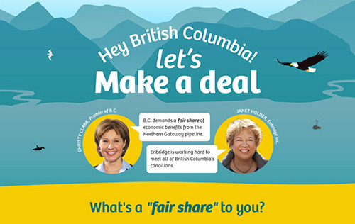
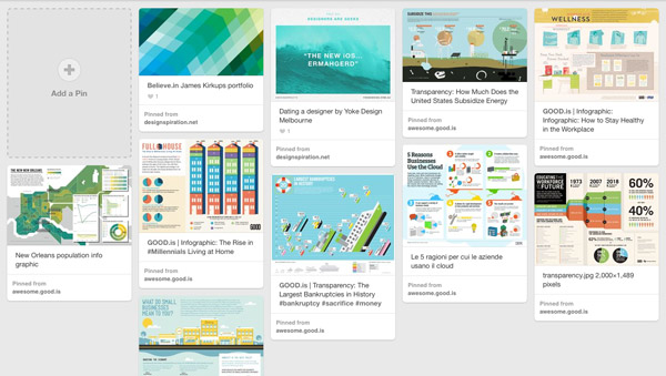
You could call this “visual research”. Like the overall discovery stage, this helps the designer and client get on the same page visually. I use mood boards to help decide on a style direction generally (e.g. a little 3D with bright colours and illustrations vs muted colours and photography). Then style tiles help nail down critical pieces like colour palette, typography options and how buttons look.

Pinterest mood board for Fair Share BC
Wireframes
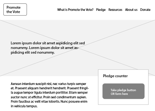
Wireframes can be more or less detailed depending on the website, but their purpose is to provide structure for a few key templates with general layout, user interactions (like filtering tools) and what features go roughly where. Wireframes for tablets and smartphones might also be done at this time.

Wireframe for Promote the Vote’s homepage
Design
Designers use different tools based on preference — including Adobe Illustrator and Fireworks, and Typecast. A typical process here could be two directions of a homepage, from which a direction is chosen to apply to key subpages as identified in the wireframe stage. My approach is to provide mockups for common mobile sizes after the desktop versions have been approved. Anything completely unique needs a design. (This is where a 2-in-1 designer-developer combo offers an advantage: fewer mockups need to be created for every detail.) Revisions happen before sign-off.
Usability testing
You know those public washroom stalls where there are bits of toilet paper all over the floor? It’s the result of a toilet paper dispenser that’s hard to use. They might not have done any usability testing. It’s the question I have every time I struggle with a badly-designed bike rack: did they test this with real people?
This is the phase where we test our assumptions. Does the visitor arrive at particular content in the way you expect them to? Can they find the newsletter sign-up link? Does the colour of a button on a very important form confuse them so they never complete the process? Does “Join us” make sense, or would “Sign up” be better — for your audience?
There are a few forms usability testing can take, so the point in the process at which it’s done will vary. But, the sooner the better. You can also iterate after the site’s been live for awhile by doing further testing — I’ll cover this at the end.
Development
This is where things get technical. And even more fun. It’s when the work comes to life (don’t you just love it when things go?). Sometimes things go wrong, and we plan for that as best we can by leaving some wiggle room in both the budget and the timeline.
Testing
Making sure your site works for everyone — including those with disabilities — is a no-brainer. Having said that, your designer is unlikely to bend over backwards to make sure your site works perfectly for your uncle running IE 8. As soon as a browser’s use share drops to less than 5-8%**, and it has quirks that aren’t easily dealt with, I let it go. Having said that, if a large proportion of your visitors are using old technology (like IE 6 to 8 or Safari 4), it needs to work for them. Visitors on the latest browsers will get the best experience, while those on old ones will have something functional even if it lacks the rounded corners and transparency supported by newer tech. (We call this progressive enhancement.)
Launch
Have a party. Tell your newsletter subscribers. Get it out in the Twitterverse and Facebooks. Then watch your Analytics (if you’re a data nerd like me, anyway).
When you release the hounds
Training
Platforms like WordPress and NationBuilder make it much easier and cheaper for you to maintain your website than back in the day when, well, these things didn’t exist. But usually some training is required to make sure you know where and how to edit certain customized features, like slideshows. Tutorials can help you get acquainted with your CMS (content management system).
Style guide
This is purely optional, but offers some guidelines that can help your content look more consistent. Things like whether news articles have a bold intro or not, what colours to avoid and best practices around linking to other websites and pages. (Please, please don’t use target=_blank!) It could also cover images and headlines. It’s another way of ensuring your brand is consistent across platforms. (Audiences expect consistency of this experience.)
Some follow-up
While I recommend keeping an eye on your Analytics data regularly, I like to follow up on a website’s performance after about three months and see where things can be improved. (I get a kick out of improving conversion rates!) A/B testing (comparing strategic changes to better meet goals) can be handy to test assumptions about language, colours, placement, etc. before asking your designer to make any sweeping changes on stuff that’s unproven. Heat maps are also useful to show where people are — and aren’t — clicking on your site. The great thing about websites is they are living documents, so don’t be afraid to start with imperfect content and refine as you glean data. The only constant is change.
This isn’t an exhaustive list by any means. Other possible phases include storyboarding, prototypes and audience personas. Like the cost, these phases depend on your unique project.
Is there a process I didn’t include that you’ve found valuable? Drop me a note or tweet.
* This could be one person or a team. To simplify I’ve used “designer” throughout.
** Based on the latest results at StatCounter and w3schools.
