New design launched as thirteen cent pinball turns 3
Three years ago today, I started a blog at Blogger and didn’t really have a name for this new “thing,” didn’t know where it was going, and didn’t know precisely what to write about. I’m still writing about topics almost as broad as my own interests, and frankly, I don’t think I know much better where it’s going but at least it has a name: thirteen cent pinball.
About eight months ago I decided to upgrade my blog from Movable Type version 3 to the much improved 4. In the process, I wanted a wider page with larger font, bigger images, a cleaner and easier commenting section, and better typography. I wanted to eliminate extra steps and hurdles for users, and streamline my own process for updating content across the blog and eventually my portfolio as well.
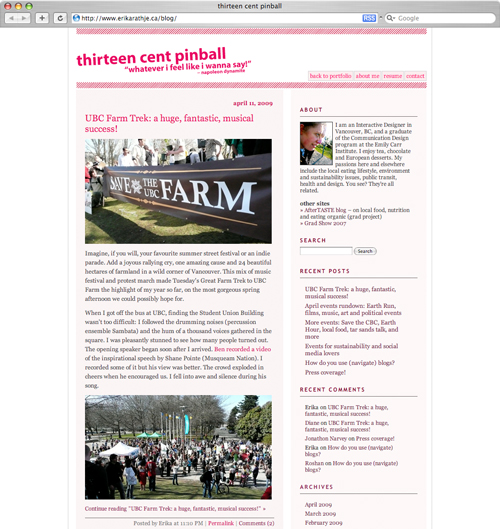
Regular visitors will recall the blog originally looked like this:

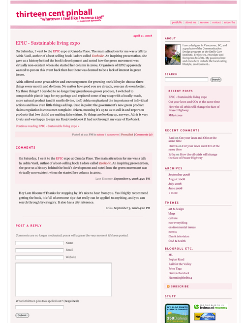
After some tweaking (in Fireworks; below), and preliminary CSS based on my existing stylesheet, the next stage ended up being mostly ignored for the next few months.

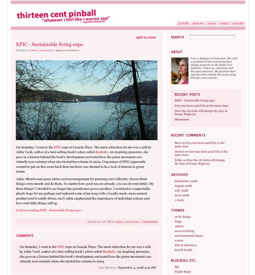
Come the end of February (below) not much had changed, but I then started getting ideas from blogs by designers Jason Santa Maria and Scott Hansen, and analysing the features of my friends’ blogs.

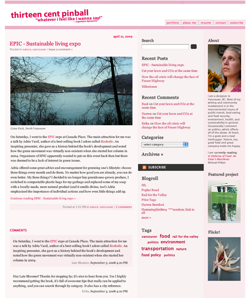
I applied my usual attention to detail to an updated URL format, more useful post metadata, auto-approved comments (so long as you answer the comment challenge correctly!), and personal info retained by default (but able to change). I’ve added a tag cloud, and condensed my categories into a drop-down except on the archives page, which is also more concise. The content of the blogroll is limited to what really matters. The far right sidebar allows me to feature my favourite and/or latest work from my portfolio. More useful bits and badges will be added in the future.

Removing unnecessary white space between columns and on the outside allowed me to add a third column and tighten up the design. This solved the problem of a long line length in the updated two-column design and provided a good solution to displaying items I would otherwise have put into a less visible footer.
Through an organic progression of ideas and desires over the course of a long timeline, the blog overhaul morphed from being a minor “facelift” to a much more thorough redesign—not a rebrand, or a significant change of character, but a careful reconsideration of every part of the look and function.
I love it and am excited to finally show you. Now, what do you think?

