David Suzuki’s Queen of Green gets a facelift — the brand, that is
While I’m mainly devoted to the web in my design practice as well as at my job, I do wear many hats in my work at the David Suzuki Foundation. I recently took on a rebrand of David Suzuki’s Queen of Green, the Foundation’s expert on green living and one of our most public faces. The Queen of Green, Lindsay Coulter, writes a weekly blog, offers tips and recipes, and has regular media appearances. Her recipes and other public materials lacked cohesive, formally executed branding, so when it was time to have a fresh go at the content of her resources, we gave her work a proper identity.
 Branding extended to social media like Twitter
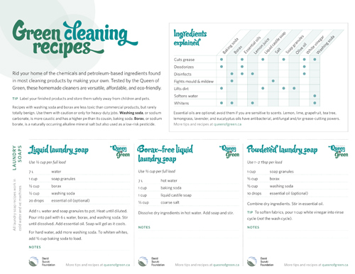
 Green cleaning recipes, available in PDF
Lindsay’s green cleaning recipes were the first of her resources to undergo a needed makeover — a transition to her new brand and more consistent copywriting. We introduced a new, more compact format that reduced paper and offered users more flexibility in terms of where they use and how they access the recipes. We also included a chart to help people make their own recipes by understanding what different ingredients do. (Vinegar really does cut grease, I tried it!) This project was incredibly fun and the response has been positive. In its first two weeks, it achieved nearly 400 downloads, making it the second most popular downloadable resource on our website.
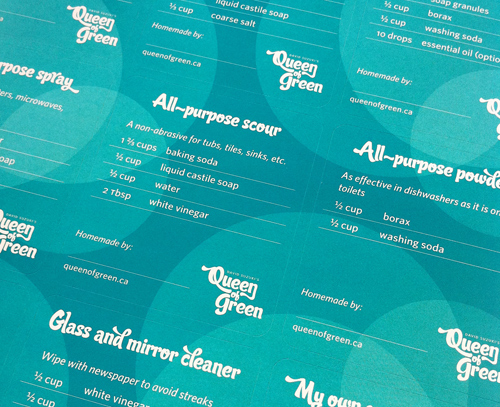
 Green cleaning recipes in sticker format
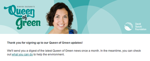
I introduced a branded email header so her monthly digest subscribers will get a Queen of Green experience instead of straight-up DSF, offering a visual separation from our regular newsletter. If you sign up for her digest, you may have a chance at receiving a sheet of nine custom-sized labels I designed, with eight green cleaning recipes and one blank make-your-own. A tidy combination of ingredients list and recipe, the labels are intended to be affixed to your cleaner’s container, making it easier to make some more when you run out. It also says what it’s intended for and how much to use, so when your significant other who may be clueless to your green god(dess) ways goes to use it (or make some more), they’ll know what to do. The labels are similarly helpful if the home-made product is a gift.

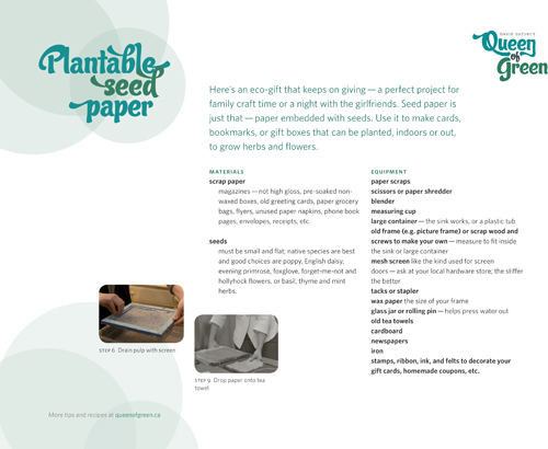
I’m looking forward to seeing the rest of her old resources, like the recently updated seed paper recipe, undergo the same branding process.
This was my first formal (re)branding experience, and the first time I’ve produced stickers, which have their own unique considerations like a custom die, spot colours and label stock. For you non-designers: that means a ton of learning! I couldn’t have asked for a more exciting project or workplace in which to do it. Stay tuned for more Queen of Green content on the David Suzuki Foundation website.


